
 Latest images
Brian's Workshop
+10
Pancake
Dasani
code1124
Aero
FailureParth
BoredRuffles
[Owner]Minh
Jeroen
Swifter
Inferno
14 posters
:: Additional Forums :: Media
Page 1 of 3
Page 1 of 3 • 1, 2, 3 ![]()

Brian's Workshop
![]() Inferno Tue Dec 21, 2010 2:38 am
Inferno Tue Dec 21, 2010 2:38 am
So, what do you think of my signature? Haha, Im emo. ;] I made an emo signature like my avatar. Comment, suggestions, rate out of 10. Furthermore, I redid the usertitle button for admin. What do you think of that?
I was very unsatisfied with the banner, so I decided to make a new one. Now, despite Jeroen may have spent more time on his, I don't think it looks that great. It is overly bright, and too much glow was added causing it to be hard for us to read the text. So I decided to do the opposite, and I spent less time. I kept it plain and simple. Sometimes, plain and simple is very nice, better than complications.
https://2img.net/h/i204.photobucket.com/albums/bb288/brian4la/newbanner.png
Also, I made another version by making it a tad more detailed, by adding an outline to the text.
https://2img.net/h/i204.photobucket.com/albums/bb288/brian4la/newbanner2.png
Personally, I like both versions. One looks decent in a simple way, the other looks decent in a more complex way.
Tell me what you think of the banners. Is it better than Jeroen's? If so, which banner should be used? Furthermore, I'd like some comments & suggestion for all of my work.
For people who want signatures, please follow the format.
What do you want your signature to say?
What font do you want? If you don't have one, perhaps you can state what style of font. (e.g: Graffiti, Thin, etc)
What colors do you want to be in your signature?
Last edited by Inferno on Wed Dec 22, 2010 5:27 pm; edited 1 time in total

Inferno- Administrator

- Amount of Messages : 264
Register Date : 2010-12-20

Inferno- Administrator
- Amount of Messages : 264
Register Date : 2010-12-20
Re: Brian's Workshop
![]() Swifter Tue Dec 21, 2010 5:32 am
Swifter Tue Dec 21, 2010 5:32 am
I like the DivideMS where it is outlined but Jeroen's is also good....its too hard to pick :O

Swifter- Growing Activity

- Amount of Messages : 48
Register Date : 2010-12-21
Re: Brian's Workshop
![]() Jeroen Tue Dec 21, 2010 9:24 am
Jeroen Tue Dec 21, 2010 9:24 am
Well i like the the banner wich it is now.
It took me a hell of work to create the explode kinda effect.
And its so bright because i wanted it to match with the chibi.
It took me a hell of work to create the explode kinda effect.
And its so bright because i wanted it to match with the chibi.

Jeroen- Administrator
- Amount of Messages : 46
Register Date : 2010-12-20 -

Re: Brian's Workshop
![]() [Owner]Minh Tue Dec 21, 2010 11:34 am
[Owner]Minh Tue Dec 21, 2010 11:34 am
i like more the one that we have now, sorry brian
![[Owner]Minh](https://2img.net/u/3414/14/55/83/avatars/2-77.jpg)
[Owner]Minh- Owner

- Amount of Messages : 71
Register Date : 2010-12-20
Age : 28
Re: Brian's Workshop
![]() Inferno Tue Dec 21, 2010 4:27 pm
Inferno Tue Dec 21, 2010 4:27 pm
Well his banner looks better now, since he outlined the text. =p Furthermore, he spent more time. I spent about 5 mins.
Inferno- Administrator
- Amount of Messages : 264
Register Date : 2010-12-20
Re: Brian's Workshop
![]() BoredRuffles Wed Dec 22, 2010 2:27 am
BoredRuffles Wed Dec 22, 2010 2:27 am
yup! i think it is great! and like the others have said, the outline of "DivideMs" really helped the words to stand out!
PS. TKS Brian, looks good!
PS. TKS Brian, looks good!
BoredRuffles- Very Active Poster

- Amount of Messages : 181
Register Date : 2010-12-22
Age : 28

FailureParth- Active Poster

- Amount of Messages : 146
Register Date : 2010-12-20
Age : 28
City : Upp your butt around the corner
Re: Brian's Workshop
![]() Inferno Wed Dec 22, 2010 3:51 pm
Inferno Wed Dec 22, 2010 3:51 pm
FailureParth wrote:Sexy brian, sexy. you looks constipated
Lol. Damn it, Parth. Can't you see that I am not constipating? Taking siggies requests. Don't know when they will be finished though. Cause I am just doing this cause I am bored. Usually, I work on sigs after I am done whatever I am doing for the site.
Inferno- Administrator
- Amount of Messages : 264
Register Date : 2010-12-20
Re: Brian's Workshop
![]() Aero Wed Dec 22, 2010 4:39 pm
Aero Wed Dec 22, 2010 4:39 pm
Lol, hey Brian, you wanna make one for me please? I don't think I could do anything artistically well.
Aero- Growing Activity
- Amount of Messages : 23
Register Date : 2010-12-20
Re: Brian's Workshop
![]() Inferno Wed Dec 22, 2010 5:25 pm
Inferno Wed Dec 22, 2010 5:25 pm
Aero wrote:Lol, hey Brian, you wanna make one for me please? I don't think I could do anything artistically well.
Sure thing. So I will make it say Aero? And in what font, do you want it to be? What colors do you want in your signature? If you don't got any specific idea, I will just work with something, and see if it suits your taste.
Inferno- Administrator
- Amount of Messages : 264
Register Date : 2010-12-20
FailureParth- Active Poster
- Amount of Messages : 146
Register Date : 2010-12-20
Age : 28
City : Upp your butt around the corner
Re: Brian's Workshop
![]() Inferno Wed Dec 22, 2010 11:43 pm
Inferno Wed Dec 22, 2010 11:43 pm
FailureParth wrote:make one for me too, mofo.
For people who want signatures, please follow the format.
What do you want your signature to say?
What font do you want? If you don't have one, perhaps you can state what style of font. (e.g: Graffiti, Thin, etc)
What colors do you want to be in your signature?
If not enough details is provided, I will put my own ideas/color scheme, or whatever is missing.
Inferno- Administrator
- Amount of Messages : 264
Register Date : 2010-12-20
Re: Brian's Workshop
![]() code1124 Thu Dec 23, 2010 12:46 am
code1124 Thu Dec 23, 2010 12:46 am
I want one pl0x xD
erm...
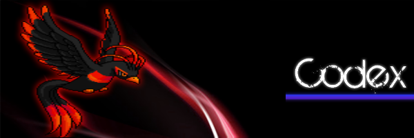
Word: Codex
Font: Something that has the words partly broken?
Colours: black, navy, white, bit of red
erm...
Word: Codex
Font: Something that has the words partly broken?
Colours: black, navy, white, bit of red

code1124- Growing Activity
- Amount of Messages : 32
Register Date : 2010-12-21
Age : 29
Re: Brian's Workshop
![]() Aero Thu Dec 23, 2010 1:01 am
Aero Thu Dec 23, 2010 1:01 am
Words: Aero
Font: Either calligraphy kinda font or graffiti like font. (Both are very different, yes I know.)
Colors: Green, white, black
Thank you Brian
Font: Either calligraphy kinda font or graffiti like font. (Both are very different, yes I know.)
Colors: Green, white, black
Thank you Brian
Aero- Growing Activity
- Amount of Messages : 23
Register Date : 2010-12-20
Re: Brian's Workshop
![]() Inferno Thu Dec 23, 2010 3:38 am
Inferno Thu Dec 23, 2010 3:38 am
Aero wrote:Words: Aero
Font: Either calligraphy kinda font or graffiti like font. (Both are very different, yes I know.)
Colors: Green, white, black
Thank you Brian
Request complete. Here is your signature.

Inferno- Administrator
- Amount of Messages : 264
Register Date : 2010-12-20
Aero- Growing Activity
- Amount of Messages : 23
Register Date : 2010-12-20
BoredRuffles- Very Active Poster
- Amount of Messages : 181
Register Date : 2010-12-22
Age : 28
Re: Brian's Workshop
![]() FailureParth Thu Dec 23, 2010 3:10 pm
FailureParth Thu Dec 23, 2010 3:10 pm
Words: Failure
Font: Broken, maybe like yours?
Colors: Black,White,Gray,etc... maybe red o_o idk
Please and ty my good sir
Font: Broken, maybe like yours?
Colors: Black,White,Gray,etc... maybe red o_o idk
Please and ty my good sir
FailureParth- Active Poster
- Amount of Messages : 146
Register Date : 2010-12-20
Age : 28
City : Upp your butt around the corner
Re: Brian's Workshop
![]() Inferno Thu Dec 23, 2010 4:42 pm
Inferno Thu Dec 23, 2010 4:42 pm
FailureParth wrote:Words: Failure
Font: Broken, maybe like yours?
Colors: Black,White,Gray,etc... maybe red o_o idk
Please and ty my good sir
Will be worked as soon as I am done Codex's.
BoredRuffles wrote:Yoo! Brian, wanna do me another favor???
Perhaps. State your favor, and I will see.
Inferno- Administrator
- Amount of Messages : 264
Register Date : 2010-12-20
Inferno- Administrator
- Amount of Messages : 264
Register Date : 2010-12-20

Dasani- Poor Poster

- Amount of Messages : 3
Register Date : 2010-12-20
Re: Brian's Workshop
![]() Inferno Thu Dec 23, 2010 6:48 pm
Inferno Thu Dec 23, 2010 6:48 pm
Dasani wrote:Nice art Brian, it's pretty cool!
Thanks.
Failure's sig:

Inferno- Administrator
- Amount of Messages : 264
Register Date : 2010-12-20
fotnts
![]() Dasani Thu Dec 23, 2010 7:12 pm
Dasani Thu Dec 23, 2010 7:12 pm
What font did you use, or what method did you use to make that look like it's broken down?
Like you sign, or Failures....
Like you sign, or Failures....
Dasani- Poor Poster
- Amount of Messages : 3
Register Date : 2010-12-20
FailureParth- Active Poster
- Amount of Messages : 146
Register Date : 2010-12-20
Age : 28
City : Upp your butt around the corner
Page 1 of 3 • 1, 2, 3 ![]()
:: Additional Forums :: Media
Page 1 of 3
Permissions in this forum:
You cannot reply to topics in this forum|
|
|